Clients and customers do not associate with Groupon because of Groupon image or branding. Customers use it for discounts. Clients use it to try to get promotion.
I don't think the deal for clients is good and I think Groupon is not a sustainable business model.
Anyway, unlike a company like Apple, which has a great brand and people want to associate with it, even if it is more expensive, Groupon has a poor and weak image.
Today, here's a short look at a problem with their branding and examples of just how poor the Groupon Brand is handled and managed.
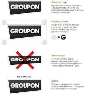
Here is Groupon internal rules on logo use (I received effective as of the date of writing of this article):
CLICK ON IMAGE FOR FULL SIZE
CLICK ON IMAGE FOR FULL SIZE
You'll notice that the rules for use of this logo are very strict (well, at least they are supposed to be). A company logo is not only the lettering, it includes the the outline. In Groupon's case, they use a quadrilateral box that has the top and the right side at 90 degree right angles.
The problem with Groupon in Japan is that it is a new company so the name is still not fully recognized and Groupon management is not competent enough to consider branding consistency.
In the second box, they specifically state, "Using the "G" as one unit, the logo must appear at least 1 unit away from all other branding, copy or graphics in the layout"
In the third image down you'll see that the rules specifically state that "the mark cannot be altered."
In the forth box, you'll see that they state that legibility must be maintained.
Yet, they greatly altered their logo in the week leading up to Valentine's day. It was changed so much so that it is hardly recognizable. There are at least three of Groupon's very own rules broken in this one ad.
Notice that there is no quadrilateral box at all and they have also broken rule #2 by committing the cardinal sin of putting something - which is laughably unrecognizable - on top of their "G". Not to mention the silly heart mark where the "O" should be.
Well, a heart mark instead of an "O"? Great. Groupon certainly scores big points in the originality department!
What an amateurish bunch of mistakes this ad is!
Google, Yahoo, Coca-Cola or Amazon might get away with this in Japan. They are huge and have been here for years. Groupon is new; already has a bad reputation in Japan and has poor market penetration.
Breaking the logo rules when you are fresh into a new market is a huge mistake and a Marketing 101 "No! No!"
Here's their latest ad that I just pulled off the Internet. Once again, the background quadrilateral box is missing. They also deleted the registered trademark logo that is supposed to appear at the top right hand side of the lettering.
As an aside, I will also say that I think this is a bad ad for two other reasons:
1) Hamburgers are cheap food. No one in their right mind is going to sign up to get a $2.00 discount on a hamburger in Tokyo when it costs you $4.00 for a round trip ticket on a Tokyo subway
2) In my opinion, this is a misleading ad like the New Year's fiasco... I doubt that this an actual photo of an actual hamburger they are selling in Tokyo.
Here's another one that violates rule #2 above about "Clearing Space." The rule states; "Using the 'G' as one unit, the logo must appear at least one unit away from all other branding, copy, or graphics in the layout."This means that there must be at least one unit of space above the logo. But, as you can see, they have it flush with the top of the ad:
Yet again, another violation of the "Clearing Space" rule:
It clearly states in rule #2 that there cannot be any lettering within
one unit space (the same size as the "G" in Groupon, yet
here again, they violated this simple rule. Is there anyone
even working in Branding at that company?
Seriously, someone there is trying to screw things up
intentionally. How else to explain this logo consistently
being used differently?
I don't think Groupon can survive with the constant mistakes they make. Like here, here, here (to name just the huge screw ups within the last 2 weeks!)
Besides, the copy cats are already here and they are numerous.
Just to reinforce to you that what I have written is true, here is a Groupon ad I just found a second ago. Once again, the branding is inconsistent. Different from the shoe ad above, it is inconsistent (yet still in violation of spacing rules).
In this one, they have the quadrilateral box. In the one with the hamburger, they don't. The "shrimp" ad also includes the registered trademark logo. The hamburger ad doesn't. Why?
Really. These are such basic mistakes.
Japanese text too close to Groupon logo at top right (March 7, 2011)
Groupon. You fools! You should have taken the $5 billion dollars from Google when you had the chance. As soon as Facebook, Google and, say, Mixi, make their own group discount service, you are dead.
I expect Groupon to crash. They can't even handle basic things like their branding and marketing?
Who could expect them to do great things like a Google or Apple? I can't.
Comment Guidelines: Comments should be succinct, constructive and relevant to the story. We encourage engaging, diverse and meaningful commentary. Comments that include personal attacks, racial, religious, or ethnic slurs are not permitted. We continuously review and remove any inappropriate comments.


No comments:
Post a Comment